VISUAL IDENTITY IDEATION
VISUAL IDENTITY IDEATION
I felt as though there were multiple avenues I could take with these attributes. So, I created four different conceptual directions that I could develop further.
After ideating these, I created a survey for feedback in order to help me decide the best route to take and how I can improve upon it. Based on the feedback, I moved forward with Iridescent Water.
- 3D Clear Water + Brutalism
- Iridescent Water
- Tranquil Green
- The Safe Option
After ideating these, I created a survey for feedback in order to help me decide the best route to take and how I can improve upon it. Based on the feedback, I moved forward with Iridescent Water.
3D CLEAR WATER + BRUTALISM
︎ Clear 3D floating water scale
︎ Wide + condensed type
︎ Black/white + cobalt blue accent
︎ Engaging, young, modern
︎ Clear 3D floating water scale
︎ Wide + condensed type
︎ Black/white + cobalt blue accent
︎ Engaging, young, modern
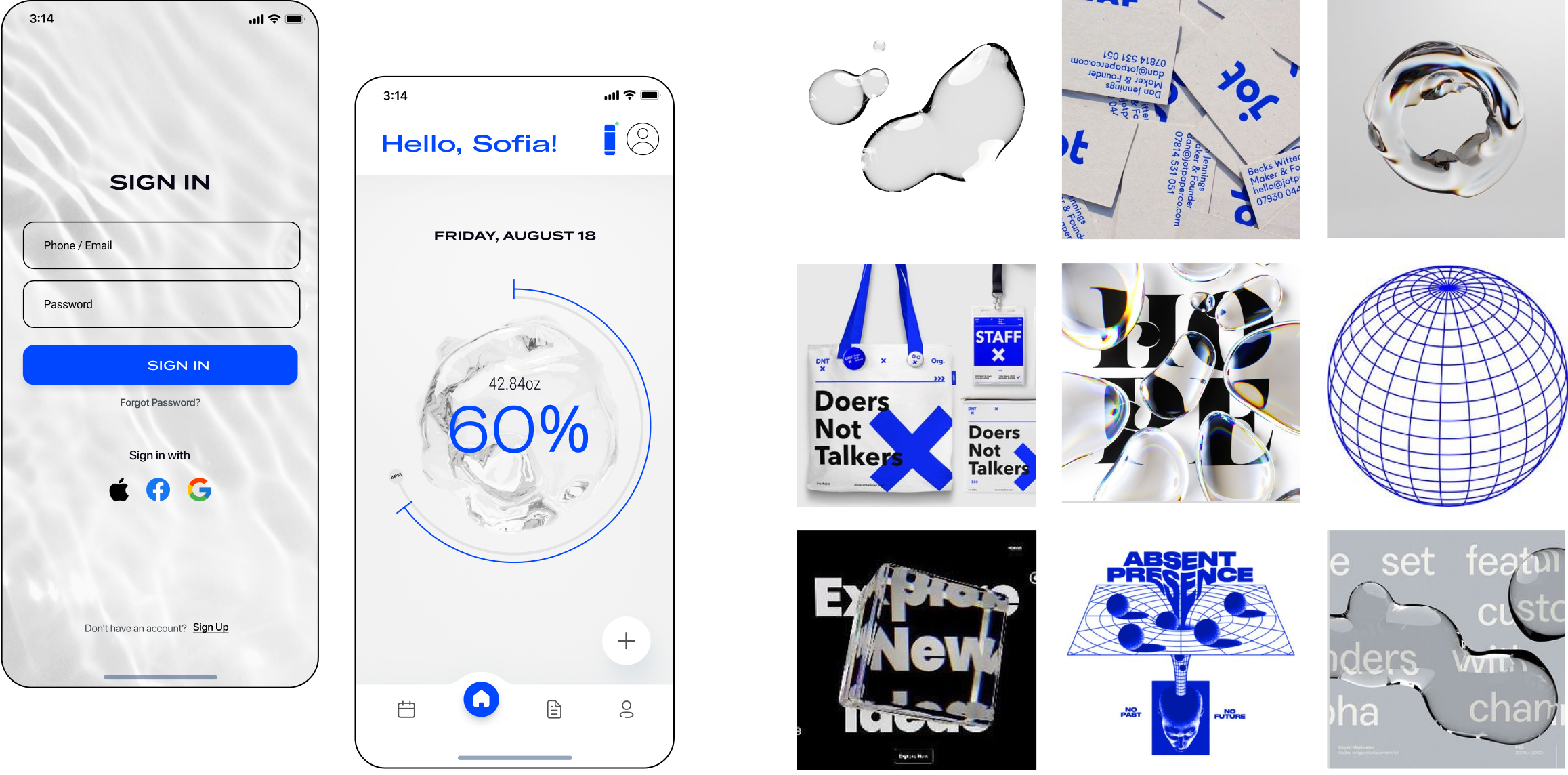
IRIDESCENT WATER
︎ Pastel color scheme based on iridescent lighting
︎ 3D water flowing scale animation
︎ Soft + light look and feel
︎ Frosted glass elements
︎ Pastel color scheme based on iridescent lighting
︎ 3D water flowing scale animation
︎ Soft + light look and feel
︎ Frosted glass elements

TRANQUIL GREEN
︎ Jade green color scheme
︎ Minimalistic, simple type treatment
︎ Light, peaceful, quite
︎ Flat, dynamic water flow scale
︎ Jade green color scheme
︎ Minimalistic, simple type treatment
︎ Light, peaceful, quite
︎ Flat, dynamic water flow scale

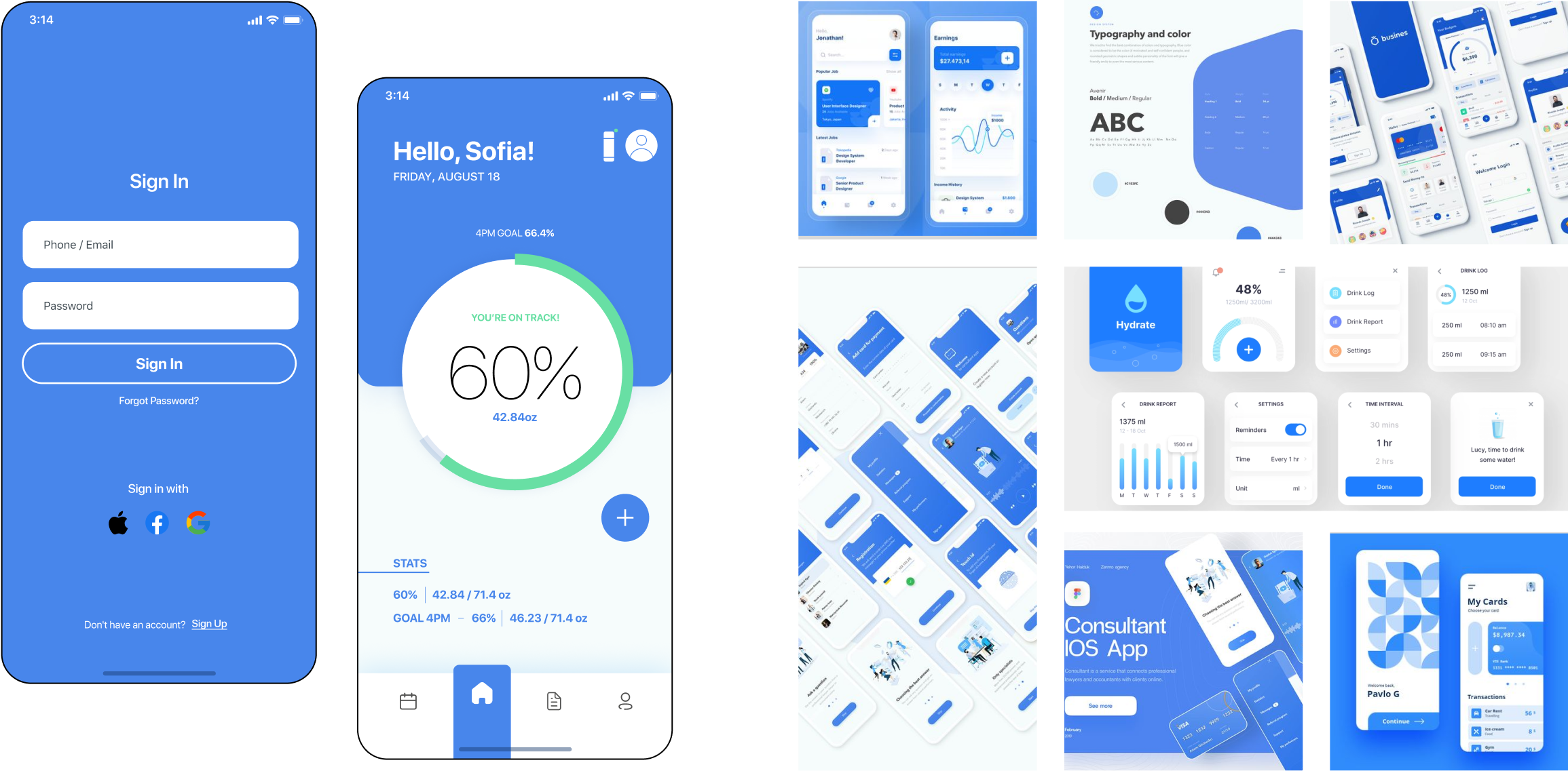
THE SAFE OPTION
︎ Blue scheme
︎ Flat, familiar UI
︎ Similar to banking apps
︎ Corporate, simple
︎ Sans serif typefaces
︎ Blue scheme
︎ Flat, familiar UI
︎ Similar to banking apps
︎ Corporate, simple
︎ Sans serif typefaces